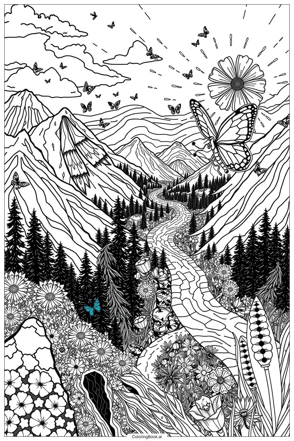
Coloring tips: How to color Butterfly Migration Path coloring page well?
Start with the butterflies in the foreground. Use warm, bold shades like orange, yellow, and deep brown to bring monarch-style butterflies to life. Add black outlines or spots along the wing edges for contrast. For butterflies in the middle ground, soften the colors slightly to help them appear farther away. Background butterflies can be left very light, using pale yellows or soft oranges, to suggest distance. Color the sky in a light blue or soft gradient from pale blue at the top to warm peach near the horizon. Use soft greens and earth tones for the hills and trees below. White or light gray works well for the clouds. Try blending two close colors on the wings, like orange and yellow, to add a natural gradient effect. Keep the overall palette warm and vibrant to reflect the energy and beauty of migration season.
Coloring challenges: Which parts are difficult to color and need attention for Butterfly Migration Path coloring page?
• Wing Pattern Precision: Each butterfly wing contains detailed veining, spots, and border markings. Staying inside these small, intricate lines requires a fine-tipped colored pencil or marker. Rushing through this step can result in muddy or blended areas that lose the wing's natural detail.\n\n• Creating Depth Across the Flock: The migration scene shows butterflies at multiple distances. Coloring foreground butterflies with rich, saturated hues while gradually lightening the color intensity for butterflies farther away takes careful planning. Without this tonal shift, the image will look flat and the sense of movement will be lost.\n\n• Sky and Background Gradients: The sky background requires a smooth color transition from deeper blue above to a warmer, lighter tone near the horizon. Achieving a clean blend without streaks or harsh lines is challenging, especially with crayons or markers. Colored pencils with gentle layering or watercolor pencils work best here.\n\n• Balancing Warm and Cool Tones: The warm orange and yellow of the butterflies must stand out against the cooler blue sky without clashing. Choosing the right background tone is important so the butterflies remain the visual focus. Too dark a sky can overpower them; too light makes the scene feel washed out.\n\n• Small Details in Overlapping Wings: Where butterflies overlap, it becomes tricky to color each one individually without accidentally bleeding into a neighboring wing. Taking time to complete one butterfly before moving to the next, and allowing colors to dry fully, helps keep each wing clean and distinct.
Benefits of coloring books: Advantages of drawing Butterfly Migration Path coloring page
Coloring this butterfly migration scene offers a wide range of benefits for children and adults alike. For younger kids, tracing the wing patterns and filling large, open spaces builds hand-eye coordination and fine motor control. Choosing and applying colors helps children develop decision-making skills and boosts their confidence as they complete each butterfly. The repetitive, rhythmic nature of coloring is naturally calming and can reduce stress or anxiety, making it a great quiet-time activity. For older children and adults, the complexity of managing depth, color gradients, and intricate wing details encourages focus, patience, and attention to detail. This page also sparks curiosity about nature. It can lead to conversations about real butterfly migration patterns, geography, and seasonal change, connecting art with science and learning. The large flock composition gives colorists creative freedom to experiment with different color combinations across many butterflies, making the page feel both structured and open-ended. Completing a detailed, beautiful scene like this gives a genuine sense of accomplishment and pride in the finished work.