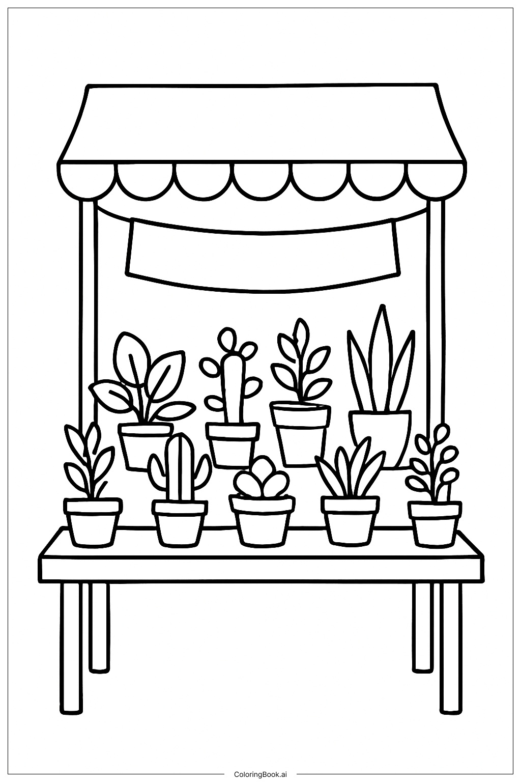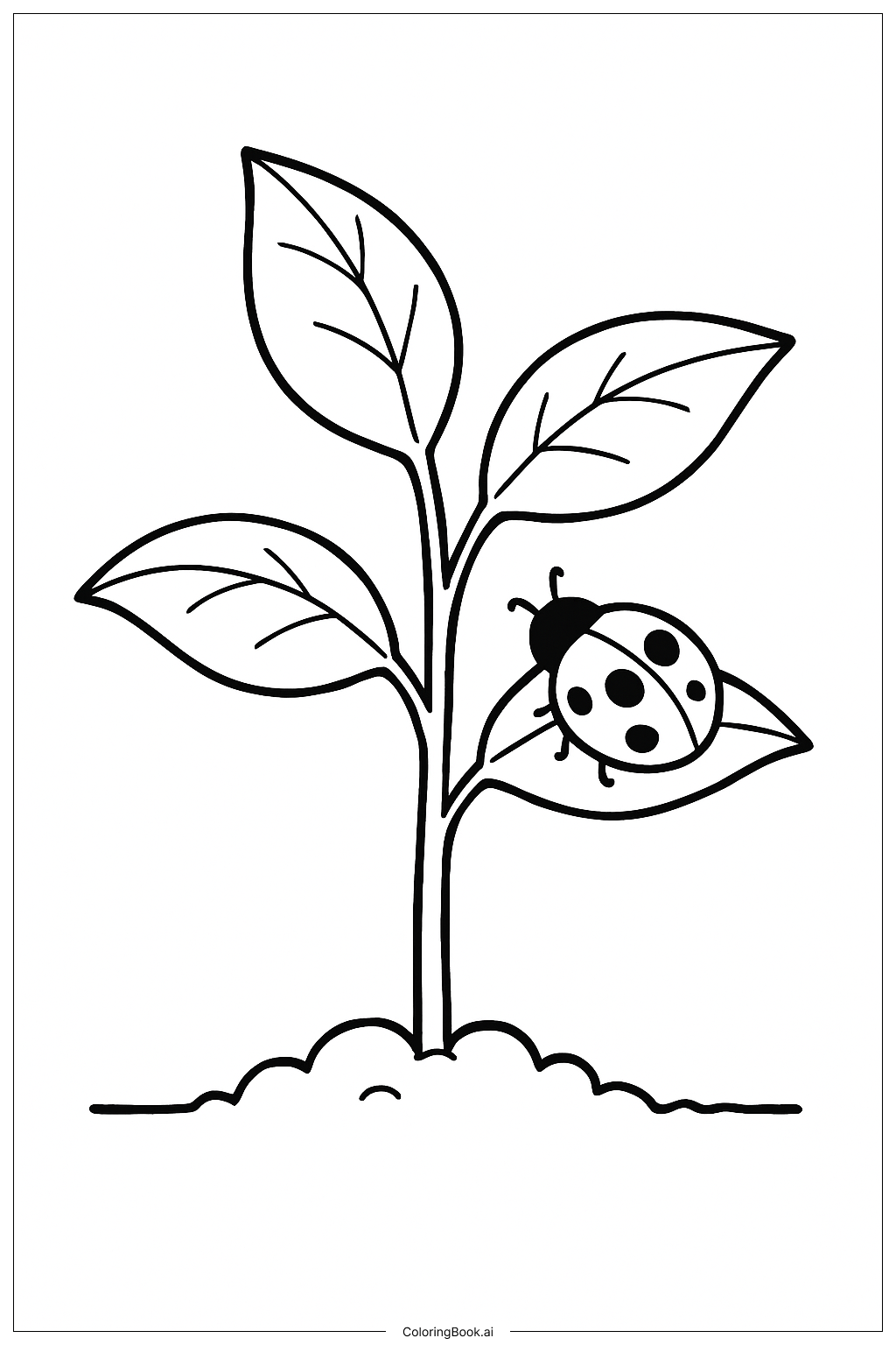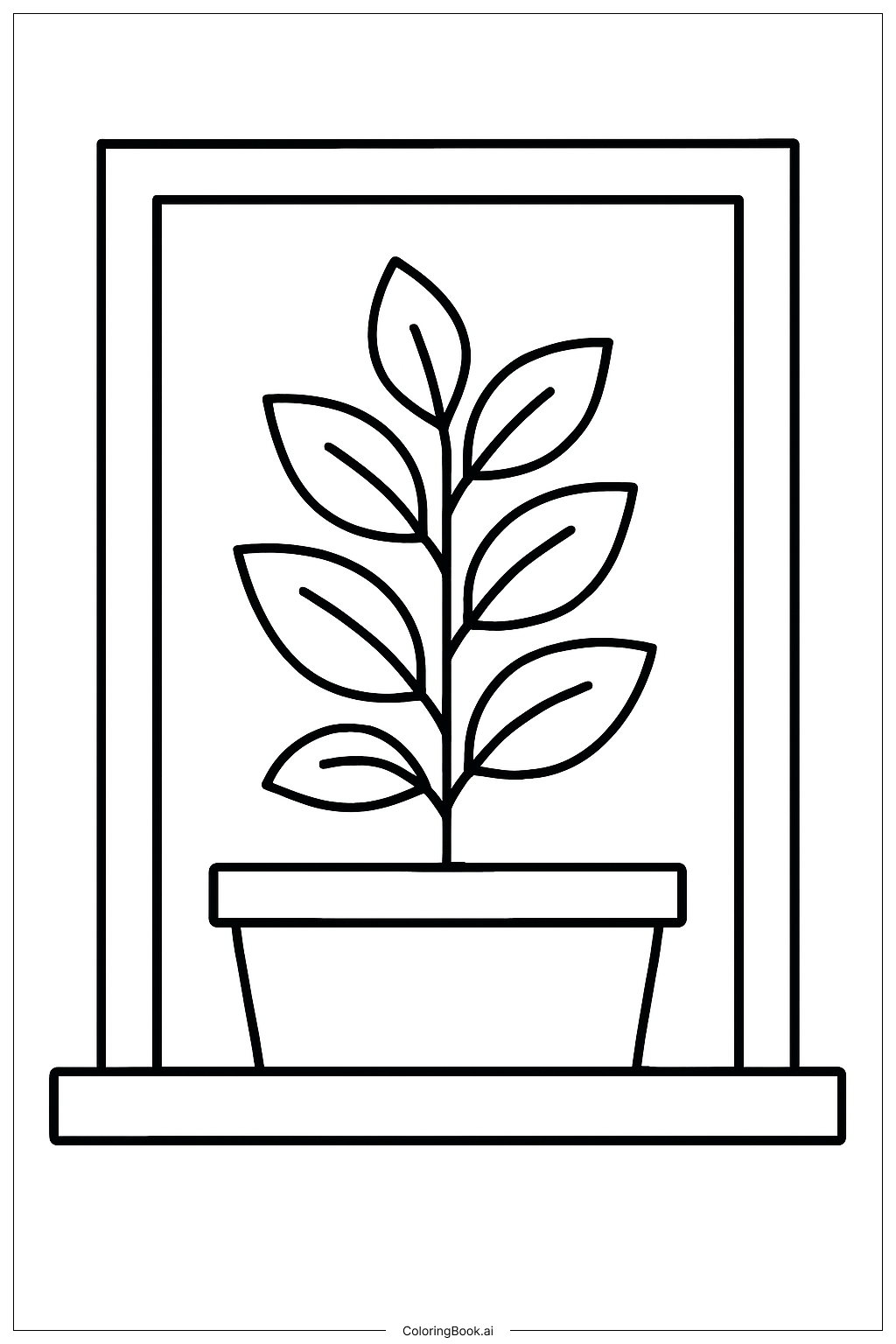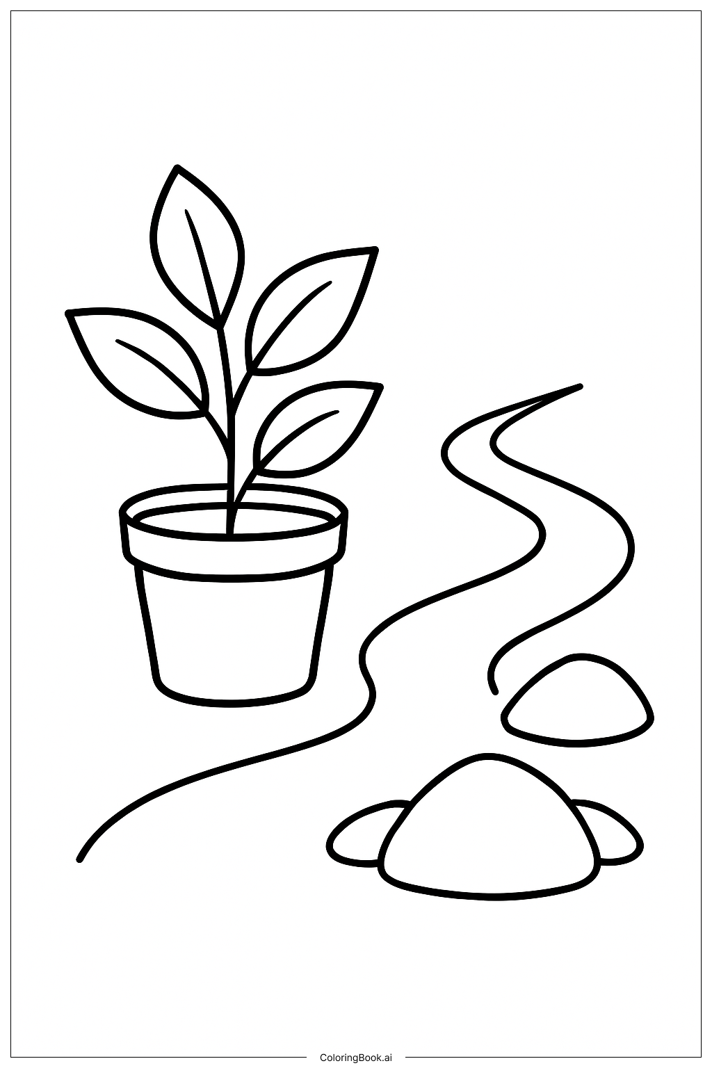
Coloring tips: How to color Potted Plant Stack coloring page well?
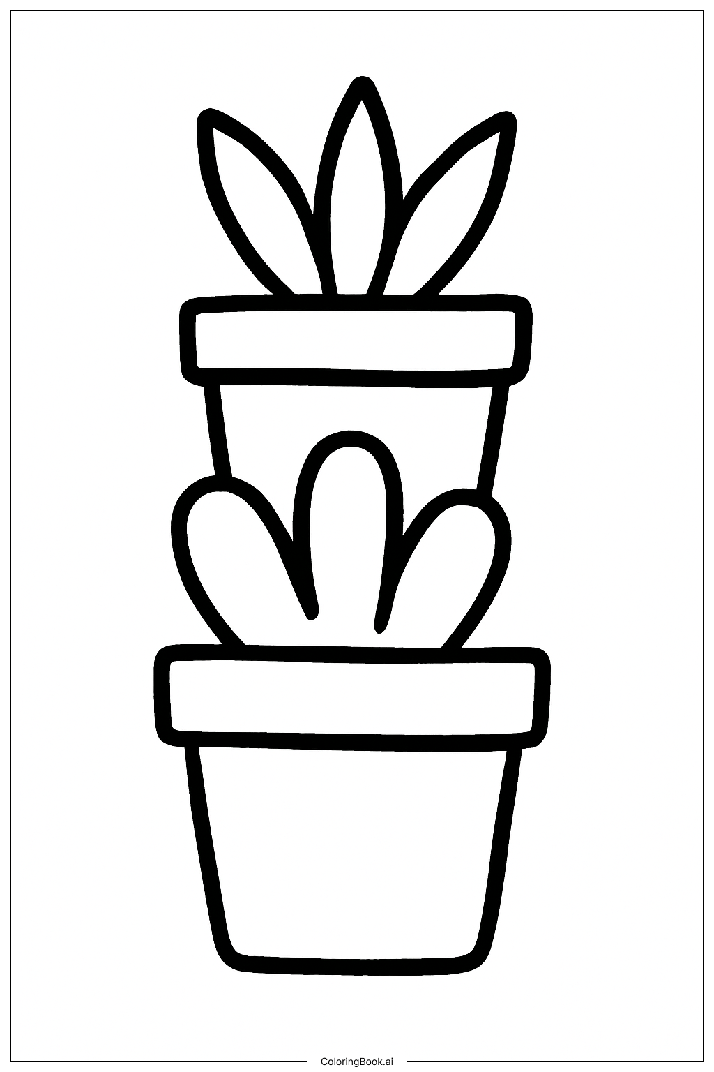
Start from the bottom pot and work your way up so your hand does not smudge wet colors. Use earthy tones like terracotta, tan, and warm brown for the pots. Try mixing shades — a lighter side and a darker side — to make each pot look round and three-dimensional. For the plants, use many shades of green. Mix yellow-green for young leaves, deep forest green for larger ones, and blue-green for succulents. Add a pop of color with bright flowers in pink, yellow, or red. Use a light grey or tan for the soil inside each pot. If you want the stack to feel fun and lively, try giving each pot a different color or pattern. Colored pencils work great for small details, while markers or crayons are perfect for filling in larger leaf areas quickly.
Coloring challenges: Which parts are difficult to color and need attention for Potted Plant Stack coloring page?
• Stacked Pot Proportions: The pots are layered on top of each other, so keeping each one looking balanced while applying color can be tricky. You need to stay within the lines of each individual pot without bleeding color into the plants or pots above and below it. Take your time with each section before moving on.
• Leaf Variety and Overlap: Many leaves from different plants overlap and intertwine across the stack. It can be hard to tell where one leaf ends and another begins. Use slightly different shades of green for neighboring leaves to help them stand out from each other and avoid a flat, muddy look.
• Small Decorative Details: Some pots have tiny patterns, rims, and surface textures that require a steady hand and a fine-tipped tool. Rushing through these details can cause colors to bleed outside the lines. A sharpened colored pencil or a thin-tipped marker works best for these tight spots.
• Creating Depth in a Tall Stack: Because the image is a tall, vertical composition, making the lower pots feel grounded and heavy while the upper ones feel lighter takes a bit of planning. Using darker shades at the base and gradually lightening your colors toward the top can give the whole stack a natural sense of depth and height.
• Soil and Root Textures: The soil and root details inside and around the pots are small but important for realism. Coloring these areas with flat, single colors can make them look dull. Try layering brown, tan, and dark grey in short strokes to mimic the look of real dirt and roots.
Benefits of coloring books: Advantages of drawing Potted Plant Stack coloring page
Coloring this Potted Plant Stack page offers a wonderful mix of fun and learning for kids and adults alike. Working through a tall stack of varied plants and pots helps build patience and focus, as each section calls for careful attention to stay within the lines. Choosing different greens, browns, and accent colors encourages creative thinking and helps develop a natural sense of color harmony. For younger children, identifying the different plant and pot shapes builds early observation skills. The variety of textures — smooth pots, rough soil, soft petals, and waxy leaves — gives colorists a chance to experiment with shading and layering techniques. This kind of hands-on practice strengthens fine motor skills and hand-eye coordination, which are important for writing and drawing. The plant theme also sparks curiosity about nature and the natural world. Finishing a detailed, layered image like this one brings a real sense of accomplishment and pride. Whether you are a beginner picking up crayons or an experienced colorist using blending markers, this page offers just the right amount of challenge to keep you engaged from the bottom pot all the way to the top leaf.