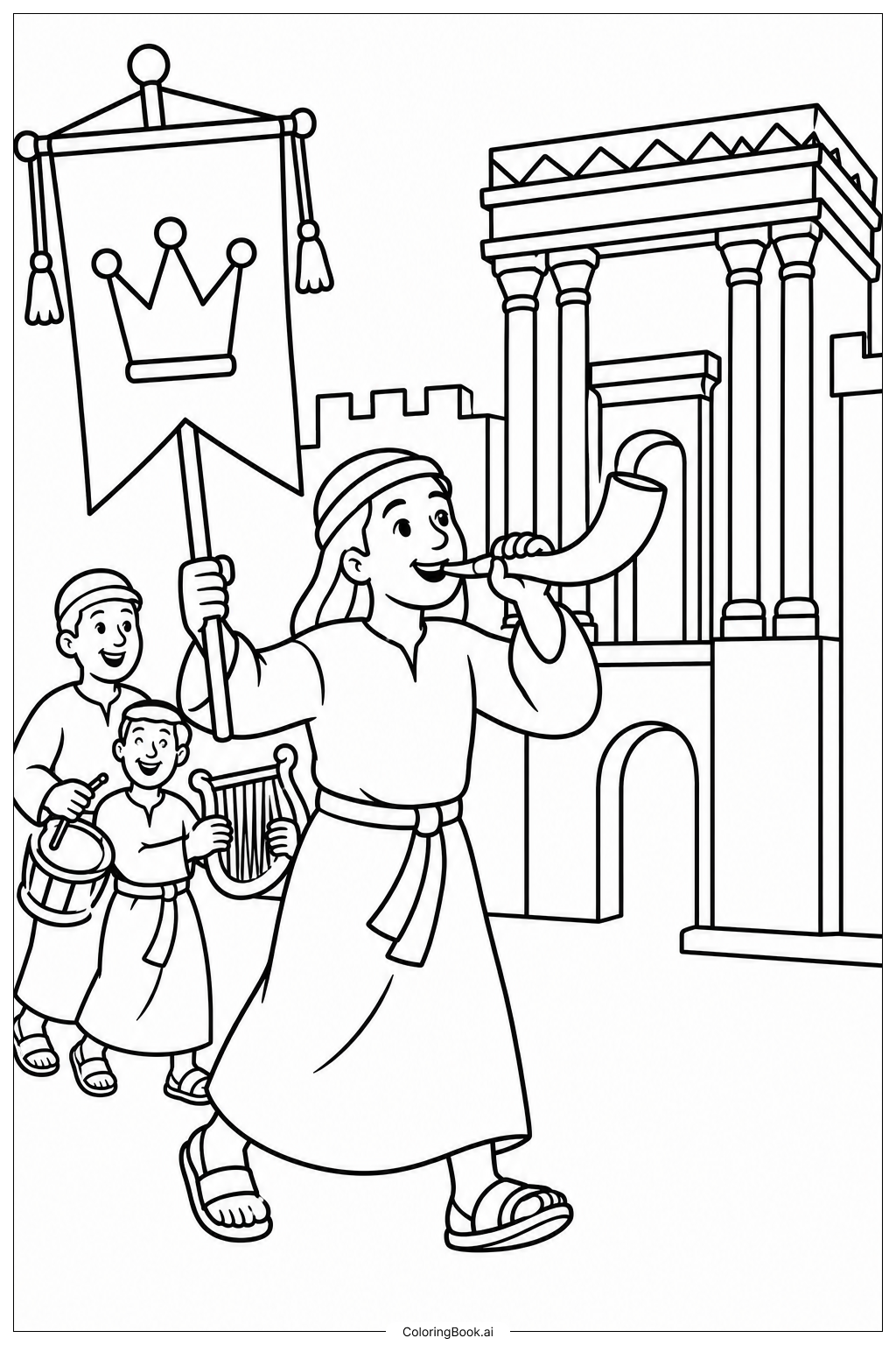
Coloring tips: How to color Festival Procession at the Beis Hamikdash coloring page well?
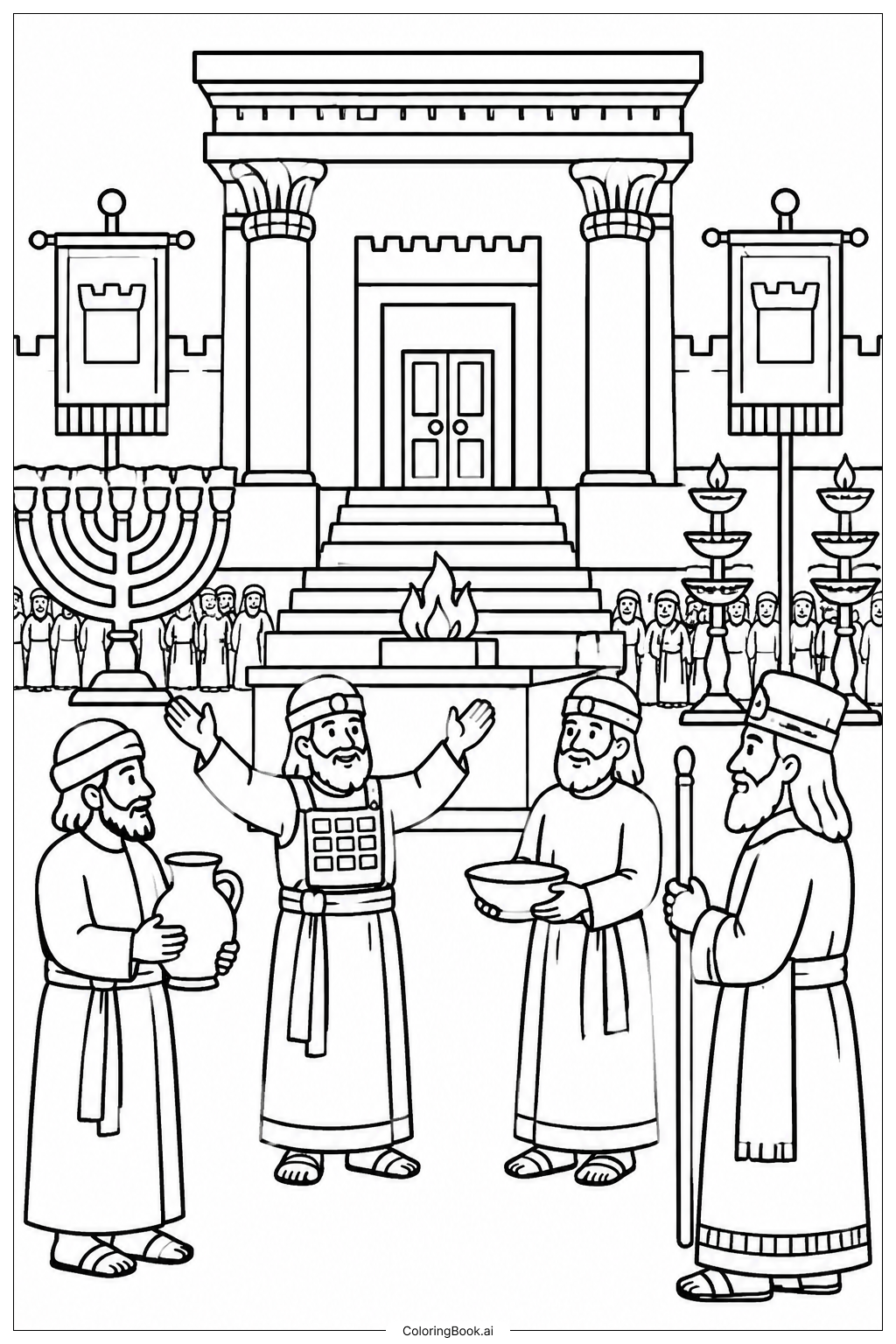
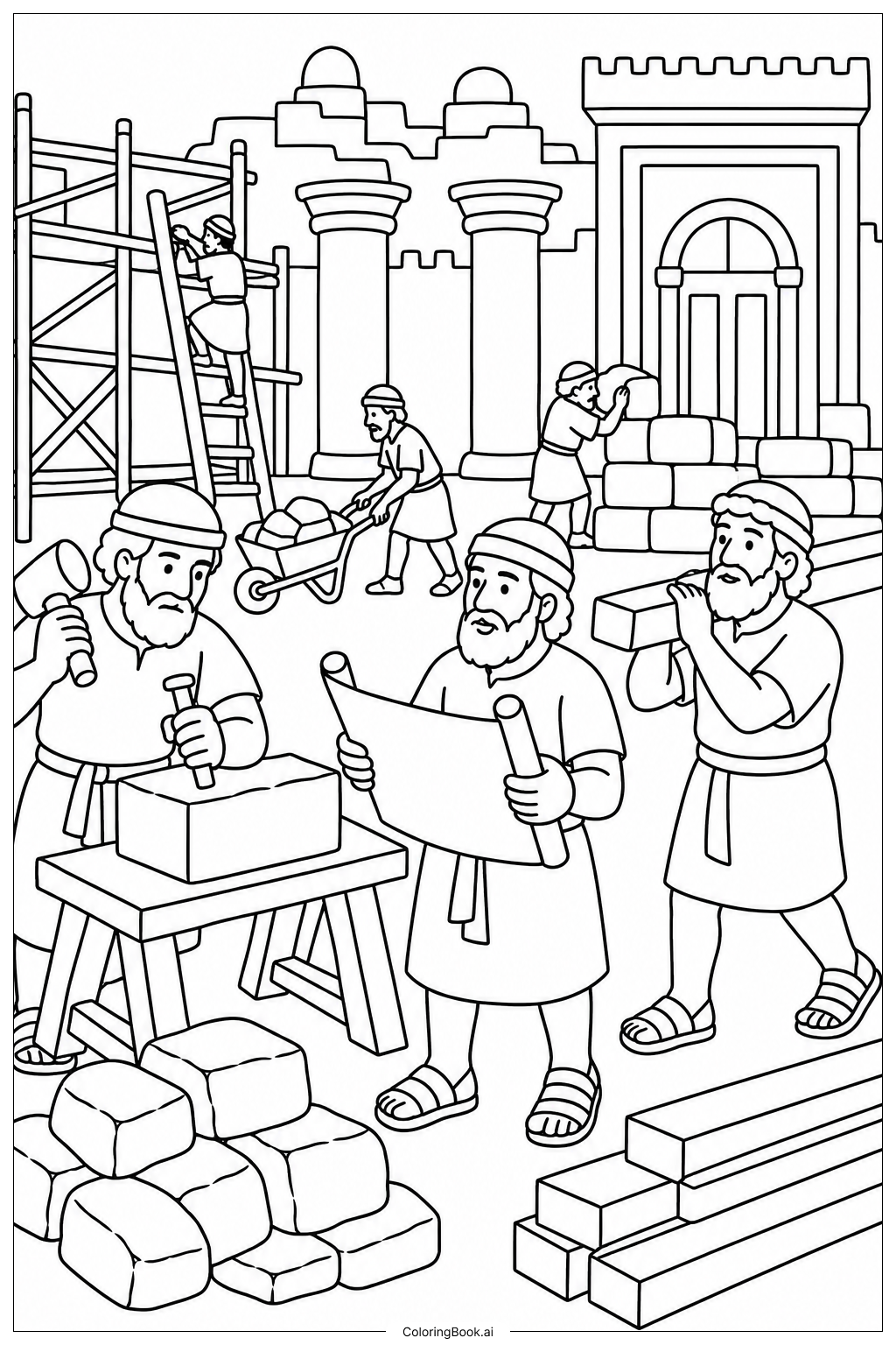
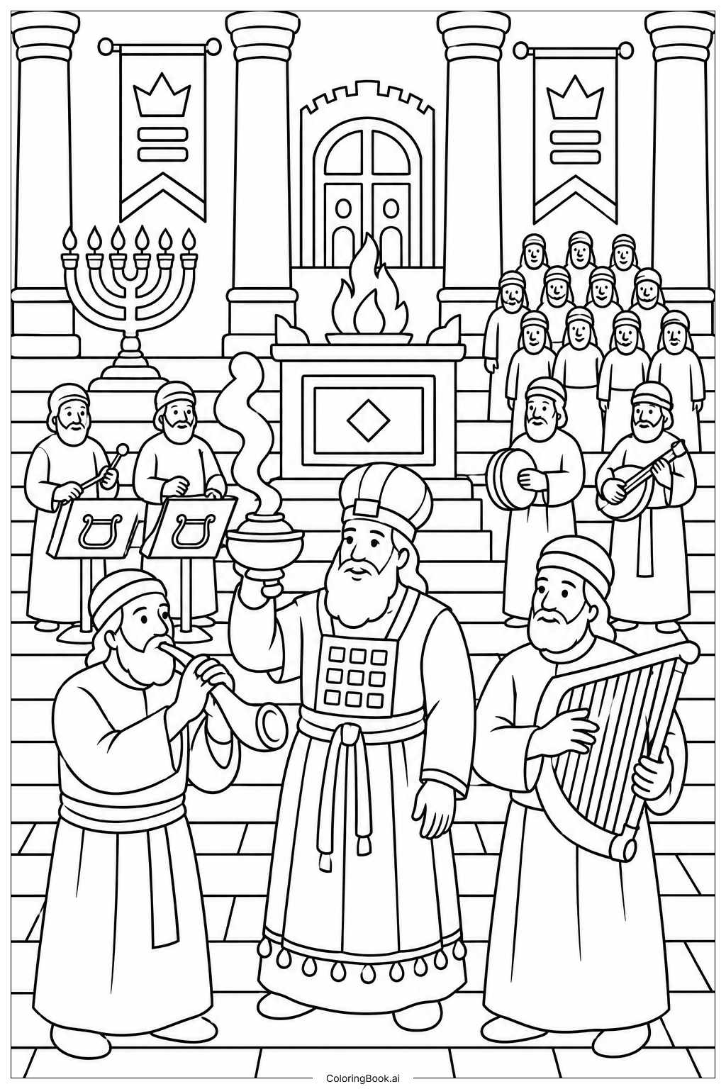
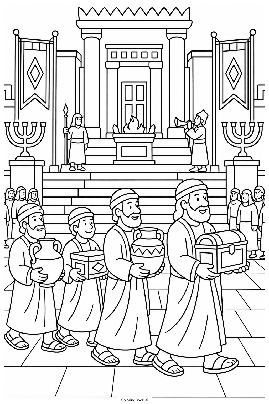
Start with the Temple building in the background. Use warm shades of gold, cream, and sandy tan to bring the stone walls and columns to life. Add soft shadows with light brown or gray to give the structure depth. For the figures in the procession, choose a variety of colors for their robes — deep blue, rich red, warm orange, and forest green all work beautifully together. Use bright yellows and greens for the palm branches and offerings they carry. The sky above the Temple can be filled with a cheerful light blue or a warm sunset gradient of peach and lavender. Keep skin tones natural and varied to reflect the diverse crowd. Younger colorists can focus on one section at a time, like the people in the front or the Temple steps, to keep the task manageable and fun.
Coloring challenges: Which parts are difficult to color and need attention for Festival Procession at the Beis Hamikdash coloring page?
• Temple Architecture Details: The Beis Hamikdash features intricate columns, carved walls, and layered stonework. Staying within the fine lines of these architectural elements requires patience and a steady hand. Thin markers or sharpened colored pencils work best for these small sections.\n\n• Overlapping Crowd of Figures: The procession includes many people packed closely together, with overlapping robes and limbs. It can be tricky to decide where one figure ends and another begins. Take time to trace each outline before choosing colors so nearby figures contrast well and stand out from one another.\n\n• Small Decorative Elements: Items like palm branches, musical instruments, and offering vessels contain tiny details that are easy to smudge or color over. Using fine-tipped tools and coloring these small objects first, before filling in the larger surrounding areas, will help keep them clean and visible.\n\n• Consistent Color Balance Across the Scene: With so many figures and architectural elements spread across the page, keeping the overall color scheme balanced can be a challenge. Without planning ahead, certain areas may end up too dark or too bright compared to the rest. Try laying out your color choices across the whole page before committing, to ensure the scene feels unified and harmonious.\n\n• Background and Foreground Separation: Creating a clear sense of depth between the crowd in the foreground and the Temple rising in the background requires thoughtful shading. Lighter, cooler tones in the background and richer, warmer tones in the foreground will help the scene feel three-dimensional and alive.
Benefits of coloring books: Advantages of drawing Festival Procession at the Beis Hamikdash coloring page
Coloring this Festival Procession at the Beis Hamikdash page offers a wonderful mix of creative, educational, and personal benefits. As children and adults work through the intricate details of the Temple architecture and the lively crowd, they naturally develop focus, patience, and fine motor skills. Choosing colors for robes, decorations, and buildings encourages creative thinking and personal expression. The act of coloring is also deeply calming. It slows the mind and helps reduce stress, making it a healthy and enjoyable activity for all ages. Beyond relaxation, this image connects colorists to a rich piece of Jewish history and tradition. It sparks curiosity about the Beis Hamikdash, the festivals celebrated there, and the vibrant community life of ancient Jerusalem. Parents and children can color together and use the scene as a starting point for meaningful conversations about heritage, faith, and celebration. For younger colorists, completing a detailed page like this builds confidence and a sense of achievement. For older colorists and adults, it offers a meditative, screen-free way to unwind while staying connected to culture and memory. Overall, this page is both an artistic activity and a meaningful journey into history.