Coloring tips: How to color Saint Patrick River Crossing coloring page well?
Use soft blues and greens for the river and hills to create a peaceful outdoor feel. For the boat, try warm browns or reds to make it stand out against the water. Color the stone bridge with light grays or beiges and add shading for a more realistic look. The sky can be light blue with white or very light gray for the clouds. You can also add some extra details if you like, such as birds or flowers near the riverbanks. Use different shades to show depth and make the picture pop.
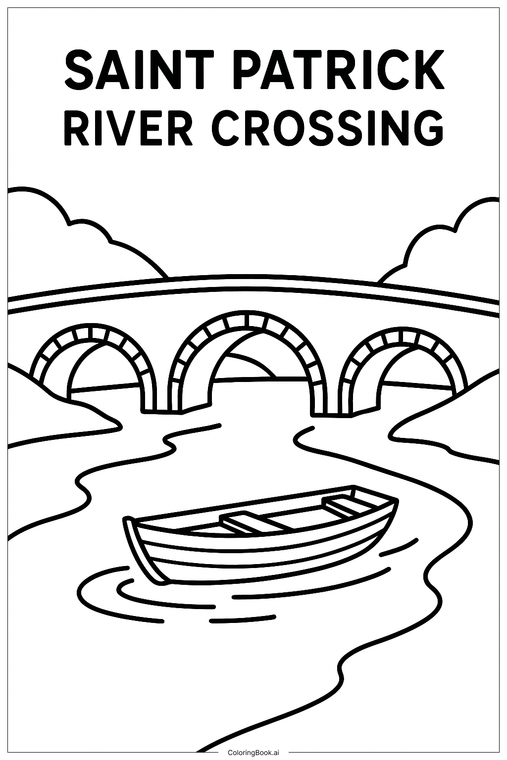
Coloring challenges: Which parts are difficult to color and need attention for Saint Patrick River Crossing coloring page?
1. Coloring the boat’s rounded edges and stripes may be tricky. Careful coloring inside the lines will help keep it neat.
2. The three arches of the bridge have small sections that might be challenging to color without overlapping.
3. The flowing river lines require smooth and even coloring to represent water well.
4. Shading the sky and clouds softly can be hard because it needs gradual color changes.
5. Managing color balance between natural elements (river, hills) and the man-made bridge may require attention to avoid dullness or too much contrast.
Benefits of coloring books: Advantages of drawing Saint Patrick River Crossing coloring page
Coloring this image helps children improve hand-eye coordination by focusing on staying within the lines, especially around small areas like the bridge arches. It also encourages creativity in choosing colors to represent nature and architectural features. The scene promotes calmness and focus by having a peaceful theme with flowing water and gentle hills. Coloring different textures, such as the wood on the boat and stone on the bridge, supports learning about varied materials. Overall, it enhances fine motor skills and artistic expression in a fun way.