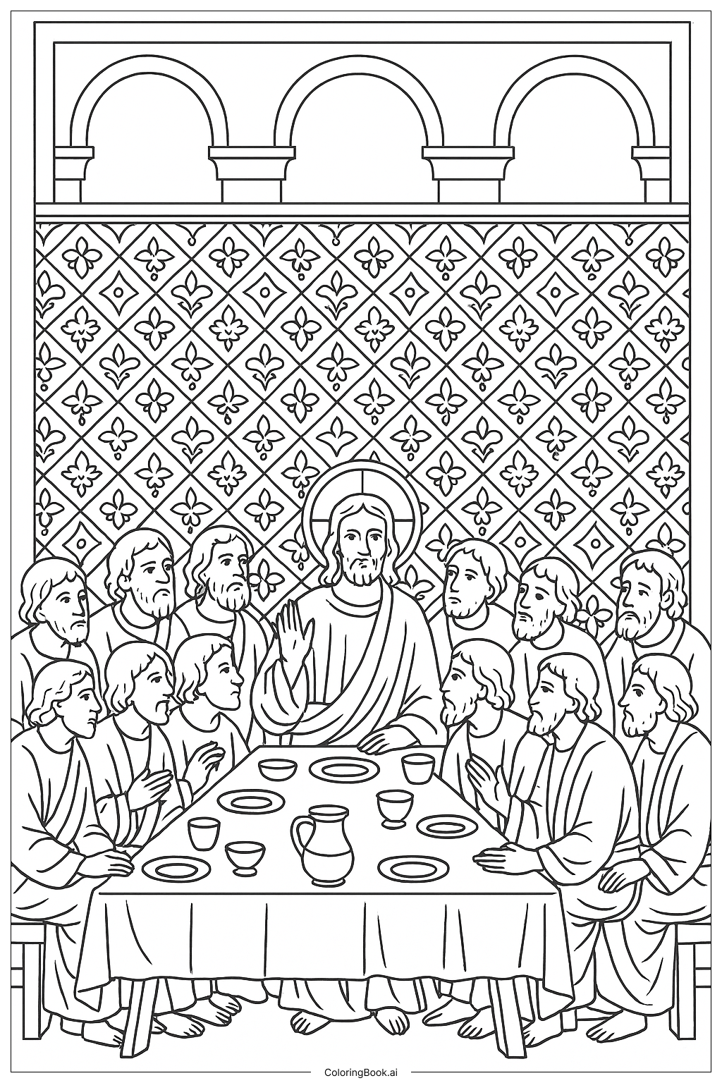
Coloring tips: How to color Last Supper Side Perspective coloring page well?
Use soft and calming colors like light blue, green, or beige for the walls to create a peaceful atmosphere. You can choose different shades for the clothes, like red, yellow, or blue, to make the two people stand out. Color the table and chairs in warm tones such as brown or tan to give a cozy feeling. You can add simple patterns or textures on the clothing to make it more interesting. Try to color the hands and faces with skin tones to keep it natural. Keep the floor a neutral color to balance the image.
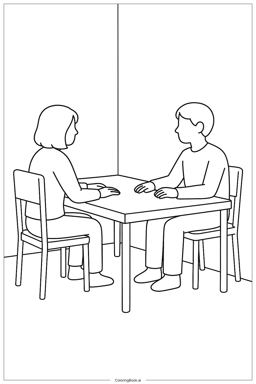
Coloring challenges: Which parts are difficult to color and need attention for Last Supper Side Perspective coloring page?
1. Coloring the hands and faces can be tricky because you need to shade them carefully to look natural and smooth. 2. The perspective of the table and chairs requires attention to keep the colors consistent and realistic, especially where the legs of the table and chairs overlap. 3. Choosing colors for the walls and floor without making the image too busy can be challenging since the background is quite plain. 4. Making the two people look different and distinct with limited details requires careful coloring choices. 5. Adding texture or shading to show depth, especially on the table surface, can be difficult but important for a good finish.
Benefits of coloring books: Advantages of drawing Last Supper Side Perspective coloring page
Coloring this picture helps improve focus and attention to detail, especially with the clean lines and perspective. It encourages the use of creativity in picking colors for the room and clothing. It also helps young artists practice coloring people and objects in a balanced way, learning about space and proportion. This calm scene promotes a relaxing coloring experience, which is good for reducing stress and building patience.