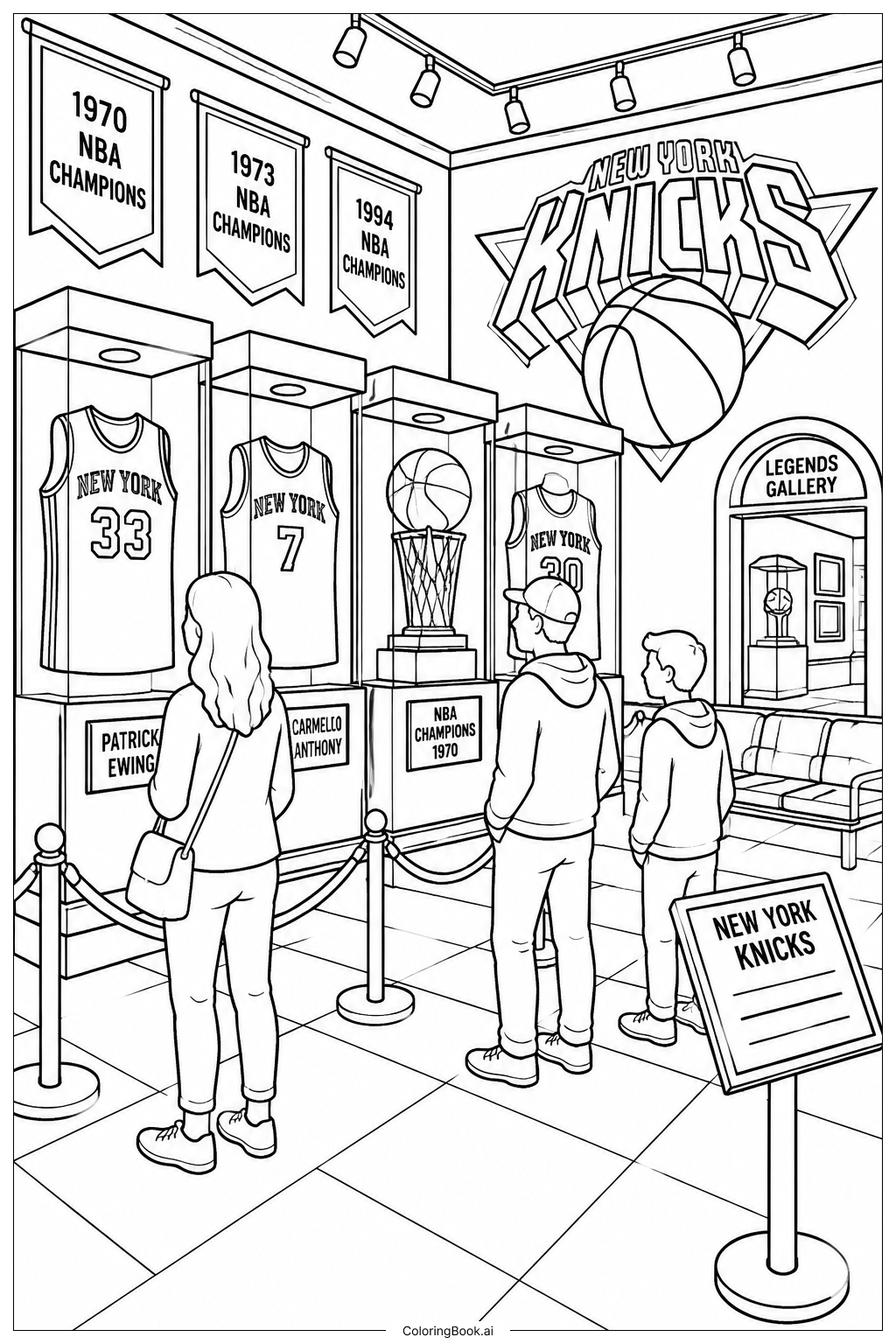
Coloring tips: How to color Knicks Street Sign Logo coloring page well?
Start with the sign background. The classic Knicks colors are blue and orange, so try using a deep royal blue for the sign panel itself. Use bright orange for the lettering to make it pop. The sign border or frame can be colored with a light gray or silver to mimic the look of a real metal street sign. The pole holding the sign looks great in dark gray or charcoal. If there are any shadow or highlight areas around the letters, try a slightly darker shade of orange or blue to add depth. Kids can also get creative and swap the classic colors for their own favorites. There are no wrong choices here. Keep your strokes steady inside the thick outlines for a clean finish. Colored pencils work well for precise edges, while markers can make the colors look bold and vivid.
Coloring challenges: Which parts are difficult to color and need attention for Knicks Street Sign Logo coloring page?
• Staying Inside the Bold Lettering: The "KNICKS" text has thick, blocky letters that may seem easy to fill, but the tight inner corners and sharp edges of each letter require careful control. Young colorists may find it tricky to fill right up to the edges without going over the outlines. Using a fine-tip colored pencil or a thin marker helps a lot here.
• Coloring the Sign Background Evenly: The large flat rectangular panel of the street sign needs to be filled with a smooth, consistent color. Achieving an even coat without streaks or uneven patches can be challenging, especially with crayons. Working in small circular strokes or layering lightly can help build a clean, solid fill.
• Managing Color Contrast: The goal is to make the orange letters stand out clearly against the blue background. Getting that contrast right means choosing the right shades. If the blue is too dark or the orange too light, the letters may not read clearly. Testing your colors on a spare piece of paper first is a smart move.
• Detailing the Sign Post: The pole beneath the sign is a narrow vertical element that requires a steady hand to color neatly. Coloring a thin shape without smudging or drifting outside the lines takes patience and a well-sharpened pencil.
• Keeping the Overall Look Balanced: Because this is a graphic logo design, every colored section should feel intentional and balanced. Mixing too many colors or over-blending can make the design feel cluttered. Sticking to the Knicks color palette keeps everything looking sharp and cohesive.
Benefits of coloring books: Advantages of drawing Knicks Street Sign Logo coloring page
Coloring the Knicks Street Sign Logo is a fun and rewarding activity for fans of all ages. For kids, it builds important fine motor skills as they practice staying inside the bold outlines and filling in the lettering carefully. The graphic, sign-based design also helps younger colorists get comfortable with geometric shapes and clean lines.
Working with the classic Knicks color palette of blue and orange introduces children to the concept of complementary colors and how contrast makes a design stand out. It encourages color decision-making and builds confidence in creative choices.
For older kids and teens who love basketball or New York City culture, this page connects art with something they already care about, making the activity feel personal and meaningful. It can spark conversations about team pride, city identity, and sports history.
Coloring also offers a calming, focused experience that helps reduce stress and improve concentration. Whether it takes ten minutes or an hour, the process of completing a page gives a satisfying sense of accomplishment. The finished result is something worth displaying, sharing, or gifting to a fellow Knicks fan.