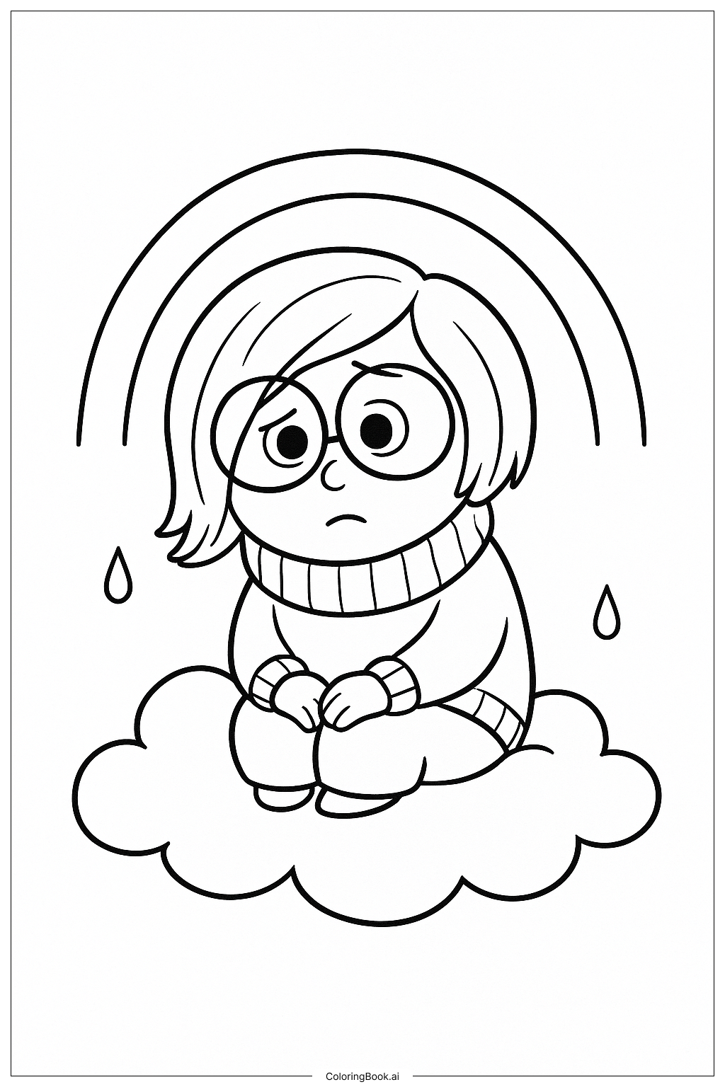
Coloring tips: How to color Inside Out Sadness On Her Cloud coloring page well?
To bring this image to life, use cool colors like different shades of blue to match Sadness’s calm personality and her signature look. You can use light blues for the cloud to make it look soft and fluffy. Try coloring Sadness with a mix of deep blue for her clothes and lighter blue for her skin. For the stars and swirls, bright yellow or soft white can create a nice contrast and add sparkle. You can also use gentle gradient shading to show the roundness of the cloud and Sadness’s glasses. Use soft crayons or colored pencils to keep the colors smooth and gentle. Have fun experimenting with different shades of blue and soft pastels to give this scene a dreamy and peaceful feeling.
Coloring challenges: Which parts are difficult to color and need attention for Inside Out Sadness On Her Cloud coloring page?
• Fine Details: Sadness’s glasses have thin frames that require careful coloring to avoid coloring outside the lines. It needs good control to keep the glasses looking neat.
• Shading the Cloud: Showing the fluffiness of the cloud with light and shadow can be tricky. It requires blending colors smoothly from white to light blue without harsh edges.
• Small Stars and Swirls: The tiny stars and swirls require precision. Coloring these small shapes evenly can be challenging for younger children.
• Facial Expression: Getting Sadness’s soft and gentle expression right involves coloring her eyes and mouth delicately, which can be hard to keep subtle.
• Limited Color Palette: Since Sadness mainly uses shades of blue, balancing different shades so the image doesn’t look flat might be difficult. Adding gradients and texture needs some practice.
Benefits of coloring books: Advantages of drawing Inside Out Sadness On Her Cloud coloring page
Coloring this image helps children develop fine motor skills as they carefully fill in small details like the glasses and stars. It encourages patience and focus because shading the cloud softly requires slow, precise coloring. Using mainly blues and soft pastels can promote creativity in mixing and layering colors to make the picture feel calm and peaceful. This page also lets children practice expressing emotions through art, as they connect with Sadness’s quiet mood and thoughtful pose. Finally, coloring this gentle scene can be relaxing and soothing, helping kids enjoy a moment of calm during or after playtime.