Coloring tips: How to color Charlie Directs A Scene At The Hazbin Hotel coloring page well?
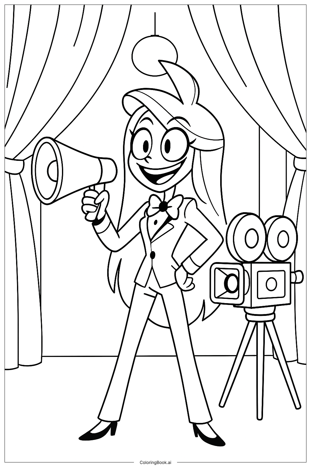
Start with Charlie's outfit using deep red for her suit jacket and pants, and crisp white for her dress shirt. Her hair looks great in dark black or very deep brown, and her skin should be a soft, pale tone. Use bright, vivid colors for her eyes — a cheerful light color like blue or gold works well to show her lively personality. For the clapperboard or any props she holds, try black and white with yellow accents. The hotel background calls for warm, rich tones — deep burgundy, gold, and dark wood browns bring the vintage gothic feel to life. Dramatic curtains can be colored in deep red or purple. Add pops of bright color to decorative details to make the scene feel grand and theatrical. Take your time with small accent pieces, as they add a lot of personality to the finished page. Light pencils or markers both work great for this image.
Coloring challenges: Which parts are difficult to color and need attention for Charlie Directs A Scene At The Hazbin Hotel coloring page?
• Charlie's Suit Layering: Charlie's outfit has multiple overlapping pieces — her jacket, dress shirt, and other accessories sit on top of each other. Keeping each layer a distinct color without letting them blend together can be tricky. Work from the background layers outward, finishing the shirt before moving to the jacket to avoid overlap mistakes.
• Facial Expression Details: Charlie's face is full of expression, with detailed eyes, eyebrows, and a lively smile. These small features are close together, making it hard to color them neatly. Use a fine-tip marker or a sharpened colored pencil to stay within the lines and preserve the emotion in her face.
• Hair Shading and Depth: Her dark hair can look flat if colored with just one shade. To add depth, use a primary dark color first, then gently blend in a slightly lighter shade along the edges or highlighted areas. This small step makes the hair look more natural and three-dimensional.
• Background Architectural Details: The ornate hotel setting includes intricate patterns, curtains, and decorative moldings. These areas have many small shapes packed closely together. Take a slow, patient approach here — alternating colors between neighboring elements helps separate them visually and keeps the background from looking too busy.
• Tonal Consistency: The overall image has a warm, gothic, theatrical mood. Making sure all your color choices feel connected — using a consistent warm or jewel-toned palette — is a real challenge but makes the final result look polished and intentional.
Benefits of coloring books: Advantages of drawing Charlie Directs A Scene At The Hazbin Hotel coloring page
Coloring this page featuring Charlie from Hazbin Hotel is a fun and rewarding creative activity for fans of all ages. It gives kids and teens a chance to engage with a character they love while building real artistic skills at the same time. Carefully filling in Charlie's detailed outfit, expressive face, and the grand hotel background helps improve hand-eye coordination and fine motor control. Choosing colors that match Charlie's iconic look encourages attention to detail and visual memory. For those who prefer their own palette, it becomes a wonderful exercise in creative decision-making and personal expression. The mix of costume details, facial features, and rich background elements also trains the eye to break a complex scene into smaller, manageable parts — a useful skill both in art and everyday problem-solving. The focused, repetitive motion of coloring is naturally calming and helps reduce stress, making it a great quiet-time activity after a busy day. Completing the full page also gives a strong sense of accomplishment, which builds confidence. Whether you are a longtime fan of Hazbin Hotel or just discovering Charlie for the first time, this coloring page is a great way to connect with the story through art.