Coloring tips: How to color Prickly Pear Background coloring page well?
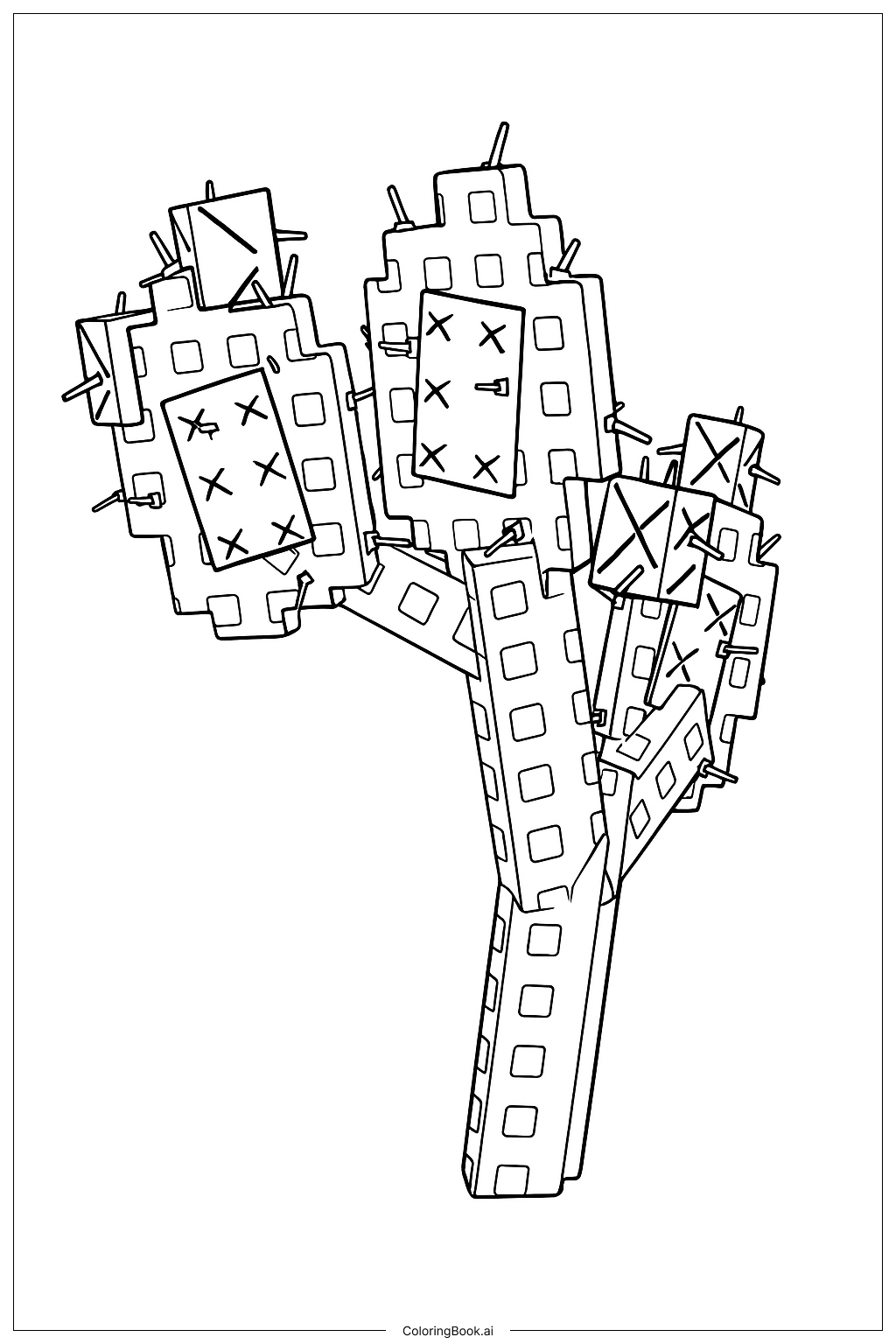
Start with the cactus pads and use different shades of green to make the scene feel natural and varied. Try light green for younger pads and deeper olive or forest green for older, thicker ones. This contrast helps the overlapping pads stand out from each other. For the spines, use pale yellow, cream, or light gray so they pop against the green. If there are flower buds, bright pink, yellow, or orange work beautifully for a cheerful touch. For any prickly pear fruit, use deep red, magenta, or purple to make them look ripe and juicy. If you want a warm desert feel, add a sandy yellow or soft peach to the background spaces. Work from the back layers to the front so colors blend smoothly. Take your time with each pad to keep the overall pattern looking balanced and fun.
Coloring challenges: Which parts are difficult to color and need attention for Prickly Pear Background coloring page?
• Overlapping Pad Layers: The prickly pear pads are stacked and layered on top of each other across the whole page. It can be hard to tell where one pad ends and another begins. Colorists need to look carefully at the outlines and choose slightly different shades of green for neighboring pads so each one reads as a separate shape. Rushing this step can make the image look flat or confusing.
• Tiny Spine Details: Each cactus pad is covered with small clusters of spines. These little details are very fine and close together, which makes them tricky to color neatly. Using a sharp pencil tip or a thin marker is important here. Trying to fill each spine individually can be time-consuming, so many colorists choose to lightly shade the whole cluster and leave the spine tips slightly lighter.
• Repetitive Pattern Fatigue: Because the design repeats across the entire background, it can feel tiring to color the same shapes over and over. Keeping your color choices consistent while still adding small variations takes focus and patience. Planning your color palette before you begin helps avoid running out of ideas halfway through.
• Flower and Fruit Accents: Small blooms and fruit details are scattered throughout the image. These are tiny compared to the large pad shapes, so switching to a finer tool for these areas is necessary. Choosing colors that stand out clearly against the green background without clashing is a small but real challenge.
• Balanced Overall Composition: Because the design fills the full page, making sure no single area looks too dark or too light compared to the rest takes careful attention throughout the coloring process.
Benefits of coloring books: Advantages of drawing Prickly Pear Background coloring page
Coloring this prickly pear background is a wonderful activity for kids and adults who love nature and the Grow a Garden theme. The repeating cactus pattern is a great way to practice focus and patience because there are so many individual shapes and details to work through. Choosing different shades of green for overlapping pads helps build an understanding of color mixing and contrast, which are real art skills. The tiny spine clusters make great fine motor practice, helping younger colorists strengthen the hand control they need for writing and drawing. Because the design fills the whole page, it gives a satisfying sense of accomplishment when finished. Working through a dense, detailed scene also helps calm the mind, making this a relaxing activity after a busy day at school. Older kids and adults can experiment with shading techniques to give the flat pads a round, three-dimensional look. The desert plant theme also sparks curiosity about cacti, desert ecosystems, and how plants adapt to dry climates, turning a fun coloring session into a small learning moment tied to the spirit of Grow a Garden.