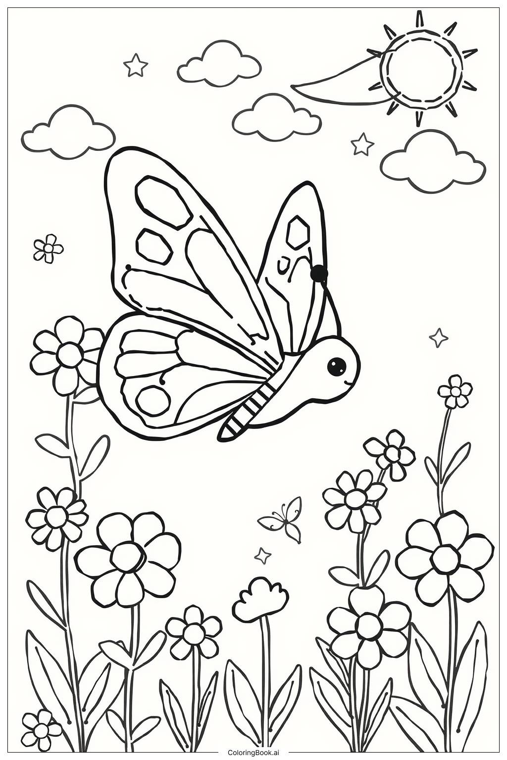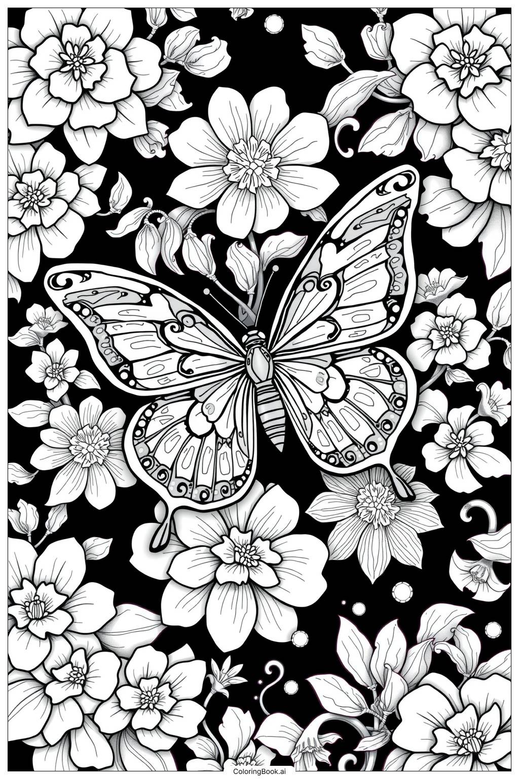
Coloring tips: How to color Flower Aesthetic Design coloring page well?
Start with the largest flowers at the center. Use soft pinks, lavenders, or warm yellows for the big petals. Give each flower a slightly different color so they all stand out. For the smaller blooms, try light peach, coral, or pale blue to create contrast. Color the leaves in shades of green — mix light green and dark green to show depth. Use a darker shade along the edges of each petal to create a shadow effect. For the swirling vines and tendrils, olive green or brown works well. The flower centers can be colored in golden yellow or deep orange to make them pop. If you want a dreamy look, try soft pastel tones throughout. For a bold and vibrant style, use bright, saturated colors. White gel pens can add highlights on petals for extra shine. Take your time with each section and enjoy the process.
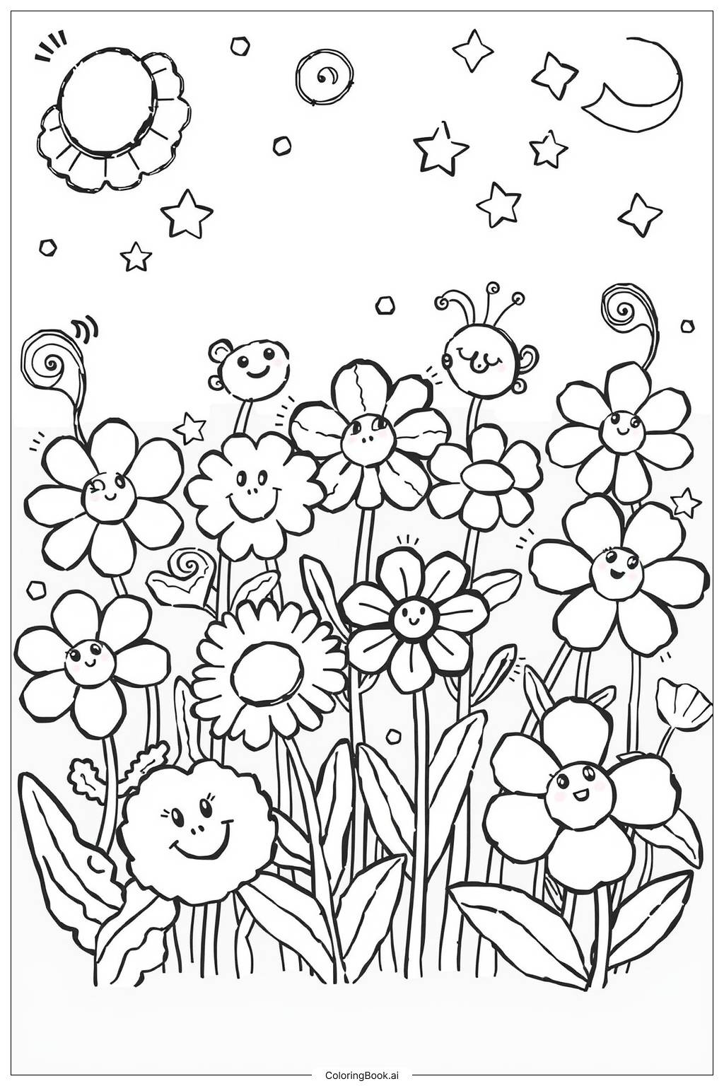
Coloring challenges: Which parts are difficult to color and need attention for Flower Aesthetic Design coloring page?
• Intricate Petal Details: Each flower contains fine lines and layered petal shapes that are very close together. Coloring inside these tiny spaces without going over the lines requires a sharp colored pencil or a thin-tipped marker. Young colorists may need to go slowly and use a light hand to stay within the boundaries.
• Overlapping Elements: Many flowers, leaves, and vines overlap one another throughout the design. This can make it tricky to decide which color belongs to which layer. Planning your color choices ahead of time and using contrasting colors for overlapping sections will help keep each element visually separate and clear.
• Vine and Tendril Sections: The curling vines and thin tendrils wind between the flowers and leaves. These narrow shapes are hard to fill cleanly because they are so slim. A fine-tipped coloring tool is strongly recommended here to avoid accidentally coloring into the surrounding petals or leaves.
• Consistent Color Balance: With so many flowers and leaves spread across the page, keeping a balanced and harmonious color scheme throughout can be challenging. Without a plan, the page may start to look mismatched or too busy. It helps to pick a palette of three to five colors before you begin and repeat them in a pattern across the design.
• Flower Center Patterns: The centers of the larger flowers contain small dots, circles, and line patterns packed tightly together. Filling these with detail colors while keeping the surrounding petals clean takes patience and a steady hand. Using a very fine pen or a sharp pencil point is key for these areas.
Benefits of coloring books: Advantages of drawing Flower Aesthetic Design coloring page
Coloring this flower aesthetic design brings a wide range of wonderful benefits for kids and adults alike. Working through the detailed petals and layered shapes helps improve hand-eye coordination and fine motor skills. Each small section asks your hands and eyes to work closely together, which strengthens these abilities over time.
The act of choosing colors for flowers, leaves, and vines encourages creative thinking and artistic expression. There are no wrong choices — every color combination teaches you something new about how colors work together.
Focusing on a detailed design like this naturally calms the mind. It draws your attention away from stress and worry, making it a great activity after a busy school day or long work session. Many people find that coloring puts them in a peaceful, meditative state.
For younger colorists, this page builds patience and concentration. Staying inside detailed lines and planning a color scheme teaches kids how to set a goal and follow through with it step by step.
For older colorists and adults, the complexity of the design offers a satisfying creative challenge. Completing a full page feels rewarding and builds a sense of accomplishment. Overall, this coloring page is a beautiful and enriching activity for anyone who picks it up.