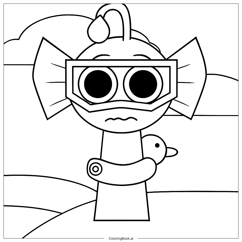
Coloring tips: How to color Sprunki Sea-Forge Guardian Rests After Patrol coloring page well?
Start with the armor by using deep steel blue and ocean gray for the main plates. Add touches of rusty bronze or copper for forged metal edges and rivets. Use dark teal and seafoam green for the scale and fin sections. Coral pink and sandy beige work well for barnacle and seaweed accents. For the background, blend soft aqua and pale navy to suggest calm underwater light. Add gentle white highlights on armor edges to give a shiny, wet-metal look. Keep the guardian's face calm using soft skin or stone tones. Use darker shades in the shadow areas to give the armor depth and weight. Layer colors slowly, starting light and building up darker tones. This approach will make the guardian look powerful yet peaceful, perfectly matching the resting mood of the scene.
Coloring challenges: Which parts are difficult to color and need attention for Sprunki Sea-Forge Guardian Rests After Patrol coloring page?
• Armor Plate Layering: The guardian's armor is made up of many overlapping plates, each with its own shadow and highlight zone. Keeping each plate looking separate while maintaining a unified look across the whole suit takes careful planning. Colorists need to decide on a consistent light source and stick to it throughout all the metal sections.
• Intricate Surface Textures: Wave engravings, anchor symbols, and forge-work patterns cover much of the armor surface. These small details require a fine-tipped tool or careful brush control to fill without bleeding into neighboring areas. Rushing through these sections can cause colors to blur together and lose the crisp detail the design relies on.
• Scale and Fin Gradients: The fin and scale sections call for smooth color transitions from deep ocean tones at the base to lighter, translucent tips. Achieving a natural gradient without harsh lines is one of the trickier parts of this image, especially for younger or less experienced colorists.
• Organic vs. Metallic Contrast: A key challenge is making the organic elements like seaweed, barnacles, and coral look soft and natural next to the hard, forged metal armor. Using matte, earthy tones for organic parts and shinier, cooler tones for metal helps, but blending the two styles at their edges requires patience and a steady hand.
• Background Depth: The rocky seafloor and water current hints in the background need to feel distant and soft so they do not compete with the guardian in the foreground. Using lighter, more washed-out versions of the main palette in the background creates the sense of underwater depth without overcomplicating the scene.
Benefits of coloring books: Advantages of drawing Sprunki Sea-Forge Guardian Rests After Patrol coloring page
Coloring the Sprunki Sea-Forge Guardian Rests After Patrol page offers a wide range of creative and developmental rewards for kids and older colorists alike. The detailed armor, textures, and underwater elements give younger children a chance to practice staying within lines and building fine motor control in a fun and engaging way. Choosing between cool ocean blues and warm forge metals also helps children develop a natural sense of color harmony and contrast. For older kids and teens, the layered complexity of the armor and the challenge of blending organic and metallic textures encourage patience, focus, and artistic problem-solving. The peaceful resting pose of the guardian brings a calm, steady energy to the coloring experience, making it a great activity for winding down while staying creatively active. Storytelling is another big benefit here. The image sparks imagination about who this guardian is, what dangers it faced on patrol, and what the ocean world around it looks like. This kind of creative thinking supports language development and narrative skills alongside the artistic ones. Overall, this coloring page is a rewarding activity that builds skill, encourages creativity, and delivers a strong sense of accomplishment when complete.