Coloring tips: How to color Sprunki Broccoli Guardian Cries Over Lost Garden coloring page well?
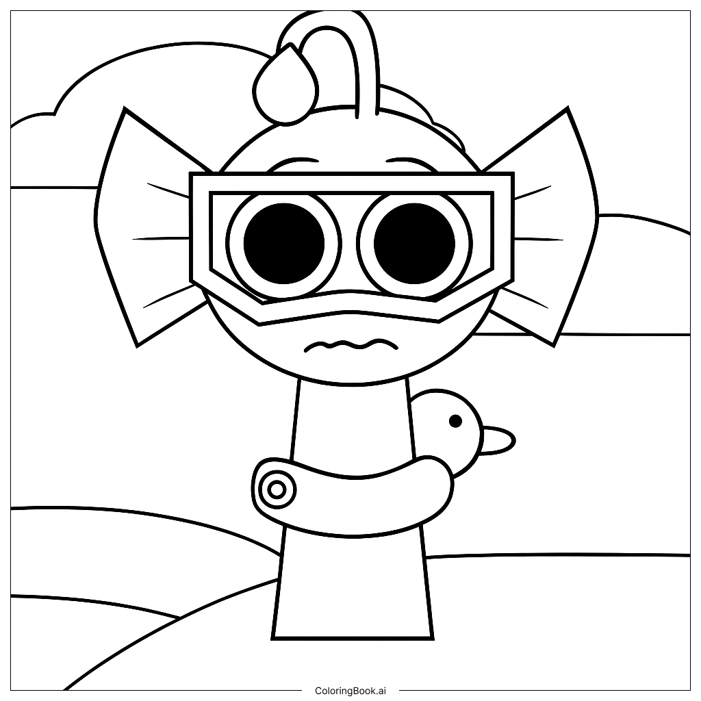
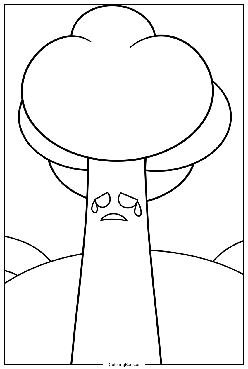
Start with the Broccoli Guardian's head. Use rich, deep greens for the broccoli crown and lighter greens for the leafy arms. The Guardian's body can be colored with warm earth tones like tan or brown to make it feel grounded and natural. Use soft blues for the tears on the face, blending gently to show emotion. Color the face with a warm peach or light brown to bring it to life. For the garden background, use muted yellows and grays on the wilted plants to show they are lifeless. Add some faded greens or browns to the cracked soil. The broken fence can be colored in pale wood tones. Use gentle, cool colors overall to match the sad mood of the scene. If you want to add contrast, try a bright patch of color on one small remaining flower to show hope.
Coloring challenges: Which parts are difficult to color and need attention for Sprunki Broccoli Guardian Cries Over Lost Garden coloring page?
• Broccoli Crown Texture: The Guardian's broccoli head is full of tiny bumps and clustered florets. Coloring this area evenly while keeping the texture visible is tricky. Try using short, circular strokes with different shades of green, such as dark forest green in the deeper clusters and bright lime green on the raised tips, to give it a realistic, three-dimensional look.
• Tear Drops and Facial Expression: The tears on the Guardian's face require careful blending. You need to color around the tear drop shapes without smudging into the skin tone. Use a light blue or pale silver for the tears, and keep a clean edge where they meet the face color. This takes a steady hand and patience.
• Wilted Plant Details in the Background: The dying plants behind the Guardian have many overlapping leaves, stems, and broken pieces. Each element is small and close together, making it hard to color them separately without the colors bleeding into one another. Work slowly from the background forward, letting each section dry if using wet media.
• Cracked Soil Patterns: The ground beneath the Guardian is broken into irregular shapes. Filling each crack section with slightly different shades of brown, tan, and gray adds realism but requires careful attention to stay within each small section. A fine-tipped tool works best here.
• Emotional Mood Consistency: Keeping a consistent sad and muted color palette throughout the whole image is a creative challenge. It is easy to accidentally make one area too bright, which can break the emotional tone of the scene. Step back often and check the overall balance of your colors.
Benefits of coloring books: Advantages of drawing Sprunki Broccoli Guardian Cries Over Lost Garden coloring page
Coloring the Sprunki Broccoli Guardian page brings many wonderful benefits for kids and families. First, it helps children practice fine motor skills by carefully coloring within the detailed lines of the Guardian's broccoli crown and the garden background. Second, this image introduces children to the concept of emotions. The Guardian is crying over something it loves, and coloring this scene helps kids talk about feelings like sadness, loss, and care for nature. This is a great way for parents and children to connect through conversation. Third, the variety of textures in the image, from bumpy broccoli to cracked earth, encourages creative thinking and color mixing. Children learn that different shades of the same color can make things look real and interesting. Fourth, completing a detailed coloring page builds focus and patience, which are important skills for school and daily life. Finally, this page gently teaches children about caring for the environment and plants, making it both a creative and educational activity. It is a fun and meaningful coloring experience for Boys and Girls of all ages.