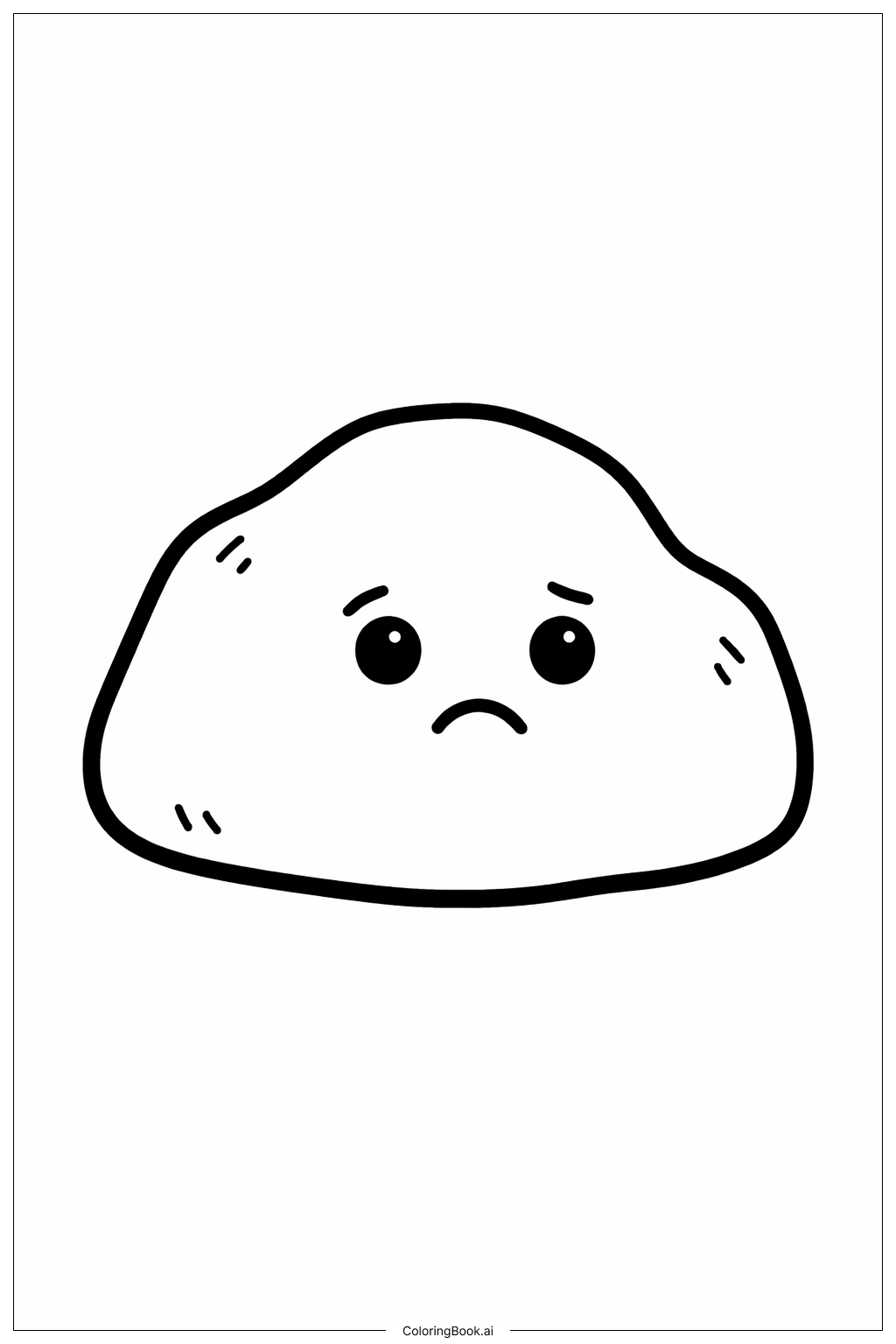
Coloring tips: How to color Emotions Lonely Rock coloring page well?
Start with the rock itself. Use shades of gray, brown, and tan to give it a natural, earthy look. Add darker tones in the cracks and crevices to create depth and texture. For the expressive face on the rock, use a slightly darker shade to make the eyes and mouth stand out gently — avoid overly bright colors so the sad mood stays intact. The small pebbles around the base can be colored in light grays or sandy tones. If there is moss, try soft greens or muted olive shades. For the background sky, use pale blues, soft purples, or even a dusky gray to match the lonely, quiet feeling of the scene. Keep your color choices calm and subdued. This image works best with a cool, muted palette that supports the emotional tone. Children can experiment with blending two shades of gray on the rock surface to practice shading.
Coloring challenges: Which parts are difficult to color and need attention for Emotions Lonely Rock coloring page?
• Rock Texture and Surface Detail: The rock's rough, uneven surface is full of tiny cracks, bumps, and grooves. Coloring these details carefully requires patience and a steady hand. Using the side of a colored pencil or a light hatching technique can help suggest texture without overworking the surface. Young colorists may find it tricky to stay within the fine lines of each crack.
• Conveying the Emotional Expression: The face on the rock is subtle — the eyes are downcast and the frown is gentle, not dramatic. Coloring the facial features too boldly can accidentally change the mood from sad to angry or blank. It is important to keep the shading around the eyes soft and to use neutral, muted tones rather than bright colors.
• Creating Depth with Limited Color Range: Because this image calls for an earthy, muted palette, colorists must rely on value (light and dark) rather than hue variety to create dimension. Blending two or three close shades of gray or brown to show where light hits the rock versus where shadows fall is a real challenge, especially for beginners.
• Background Mood Matching: Choosing a background color that supports the lonely atmosphere without overpowering the rock requires careful thought. A color that is too bright or cheerful will clash with the emotional theme. Colorists need to balance the background tone with the rock's subdued palette.
• Small Surrounding Elements: The tiny pebbles and patches of moss at the base of the rock are small and densely packed. Coloring them neatly without accidentally blending them into the rock itself takes a fine-tipped tool and careful attention.
Benefits of coloring books: Advantages of drawing Emotions Lonely Rock coloring page
Coloring this image of a lonely rock offers meaningful benefits for children and young people. Because the image is centered on an emotion — loneliness — it naturally opens up conversations about feelings. As kids color, they may begin to think about times they have felt lonely, which helps build emotional awareness and self-reflection skills.
The quiet, detailed nature of the rock's surface encourages focus and concentration. Carefully filling in cracks and textures helps children practice fine motor control and steady hand movements, which are important for writing and other daily tasks.
Choosing colors that match a mood teaches kids about the relationship between color and emotion — a valuable concept in art and in understanding the world around them. This kind of creative decision-making builds confidence and artistic thinking.
Because the image has a calm, still quality, the coloring process itself can be soothing. It gives children a peaceful activity to turn to when they feel overwhelmed or need a quiet moment. In this way, coloring the Lonely Rock is not just a creative exercise — it is also a gentle form of emotional expression and self-care that supports overall well-being.